A business can invest heavily in a website and still lose potential customers because of small problems that are easy to overlook.
A visitor may leave because the contact button is difficult to find, the website takes too long to load, the content is confusing, or the site simply does not work properly on a mobile phone.
These problems may not look serious from the business owner's perspective, but they can have a direct effect on the customer experience.
Here are seven common website mistakes businesses should watch for.
- An Unclear Homepage
Your homepage should help visitors understand the business quickly.
- A customer should be able to answer:
What does this business do?
Who is it for?
Why should I care?
What can I do next?
A homepage filled with vague statements such as "We provide innovative solutions" may sound professional but communicate very little.
Clear messaging is usually more useful than complicated wording.
For example, a service business can explain what it does, who it helps, and how someone can get started within the first few sections.
- Making Visitors Search for Contact Information
A customer who is ready to ask a question should not have to search through several pages to find your phone number or email address.
Important contact options should be easy to discover.
- Depending on the business, that can include:
- Phone
- Contact form
- Booking option
- Physical address
For mobile visitors, a click-to-call or WhatsApp option can make the process even easier.
- The goal is simple:
Make contacting the business feel effortless.
- Ignoring Mobile Users
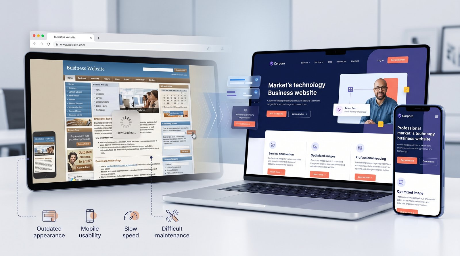
A website that works beautifully on a large monitor can still be frustrating on a smartphone.
- Common mobile problems include:
- Tiny text
- Buttons that are difficult to tap
- Horizontal scrolling
- Menus that do not work properly
- Images that overflow the screen
- Forms that are uncomfortable to complete
Mobile responsiveness should be treated as a core requirement, not a final adjustment.
Test the website on real devices rather than assuming that a responsive browser preview tells the whole story.
- Using Too Many Visual Effects
Modern websites can use animation, gradients, shadows, and interactive elements to create a polished experience.
But adding too many effects can make the website feel confusing or slow.
- Common examples include:
- Excessive animation
- Auto-playing video
- Too many pop-ups
- Constantly moving elements
- Heavy background effects
The purpose of visual design should be to support the content.
A subtle animation that helps guide attention can be useful.
Animation that distracts users from the main message usually is not.
- Slow Page Loading
Visitors expect pages to respond quickly.
Large images, unnecessary JavaScript, excessive third-party tools, and poor hosting can contribute to slower performance.
A slow website can create problems throughout the customer journey.
A visitor may never reach your service page, product page, or contact form simply because they became frustrated waiting for the page to load.
- Review:
- Image file sizes
- Scripts
- Fonts
- Hosting
- Caching
- Third-party integrations
Improving these areas can make the website feel much more responsive.
- Writing Too Much Without Structure
Having detailed information is not a problem.
Presenting it as one huge block of text is.
Visitors typically scan websites before deciding what to read in detail.
- Break content into:
- Short paragraphs
- Clear headings
- Bullet points
- Useful subheadings
- Highlighted information
For longer pages, a clear visual hierarchy makes it easier for people to find the section that answers their question.
The content should be complete without making the visitor work unnecessarily hard to understand it.
- Giving Every Visitor the Same Next Step
Not every visitor is ready to buy.
A first-time visitor may want to learn more, while another person may already be ready to request a quote.
A website can support different levels of intent with appropriate calls to action.
- For example:
- Learn More
- for someone researching a service,
- and:
- Request a Quote
for someone who is ready to start a conversation.
This creates a more natural customer journey.
- Your Website Should Answer Questions Before Customers Ask
A strong business website can reduce uncertainty.
Think about the questions customers ask your team repeatedly.
- They may include:
How much does it cost?
How long does it take?
Where do you operate?
What is included?
What happens after I contact you?
Do you work with businesses like mine?
Your website can answer many of these questions before the customer reaches out.
This can improve the experience and help sales conversations start with more useful context.
- Trust Is Part of Website Design
Visitors evaluate more than your logo and colors.
They also look for signals that the business is legitimate and capable.
- Useful trust elements may include:
- Real client reviews
- Case studies
- Portfolio examples
- Business location
- Team information
- Clear contact details
- Certifications where relevant
- Transparent policies
Trust should be built through real information.
Avoid exaggerated claims or artificial testimonials simply to make the website look more established.
- Make Your Calls to Action Consistent
Buttons should have clear language.
- Instead of vague labels such as:
- Click Here
- use specific actions:
- Request a Quote
- Book a Consultation
- Chat on WhatsApp
- View Our Services
A visitor should understand what will happen after clicking.
Consistency also matters.
If your primary action is "Get a Free Consultation," use that wording consistently where appropriate instead of introducing several nearly identical phrases.
- Keep Forms Simple
A contact form should collect enough information to start the conversation, but not necessarily everything the company may ever want to know.
- For a basic enquiry, asking for:
- Name
- Contact information
- Service
- Message
may be enough.
More complex lead qualification can happen later.
The important thing is to balance useful information with a low-friction experience.
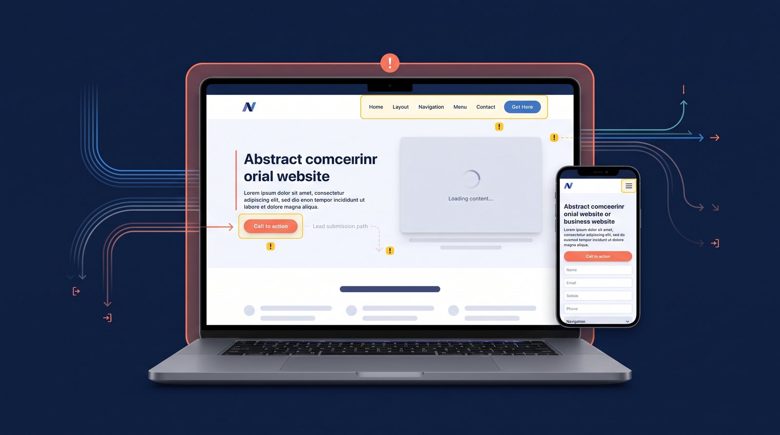
- Test Every Important User Journey
A website can look perfect while still having broken functionality.
- Before launch, test:
- Contact form → submission → confirmation
WhatsApp button → correct conversation
- Phone button → phone dialer
- Navigation → correct page
- CTA → correct destination
- Mobile menu → opens and closes properly
- External links → correct destination
These are simple checks, but they can prevent embarrassing problems after launch.
- Common Mistakes Businesses Make After Launch
Website maintenance is often forgotten once the site goes live.
- Businesses may continue using:
- Old contact details
- Outdated services
- Expired offers
- Broken links
- Old team information
- Unused pages
A website should be reviewed regularly.
Even a quarterly content review can uncover information that needs to be updated.
- A Simple Website Quality Checklist
- Before considering a business website finished, check:
- Messaging
Can visitors understand what the business does quickly?
- Mobile
Does everything work comfortably on a phone?
- Performance
Do important pages load efficiently?
- Navigation
Can visitors find information without confusion?
- Contact
Are phone, email, WhatsApp, and forms easy to access?
- Trust
Does the website provide genuine reasons to trust the business?
- Conversion
Are next steps clear?
- Maintenance
Is there a plan for keeping the website updated?
Frequently Asked Questions
There is no single mistake for every business, but unclear messaging, poor mobile usability, slow performance, and difficult contact processes are common problems.
Yes. Visual design is only one part of the customer experience. A website must also be clear, usable, fast, and easy to navigate.
There is no fixed schedule, but regular checks can help identify outdated content, broken links, and usability issues.
No. A chatbot can be useful when customers benefit from real-time or automated assistance, but it is not necessary for every business.
Not always. Some issues can be resolved through content updates, performance optimization, improved navigation, or targeted design changes without rebuilding the entire site.
Final Thoughts
A website does not lose customers because of one imperfect detail.
- The problem is usually a collection of small frustrations:
A confusing headline.
A hidden contact button.
A slow page.
A broken mobile layout.
A form that asks for too much information.
Each issue creates friction.
The best business websites remove as much of that friction as possible.
Instead of asking only whether your website looks good, ask whether it makes things easy for the person visiting it.
That is often a much better measure of whether the website is actually doing its job.